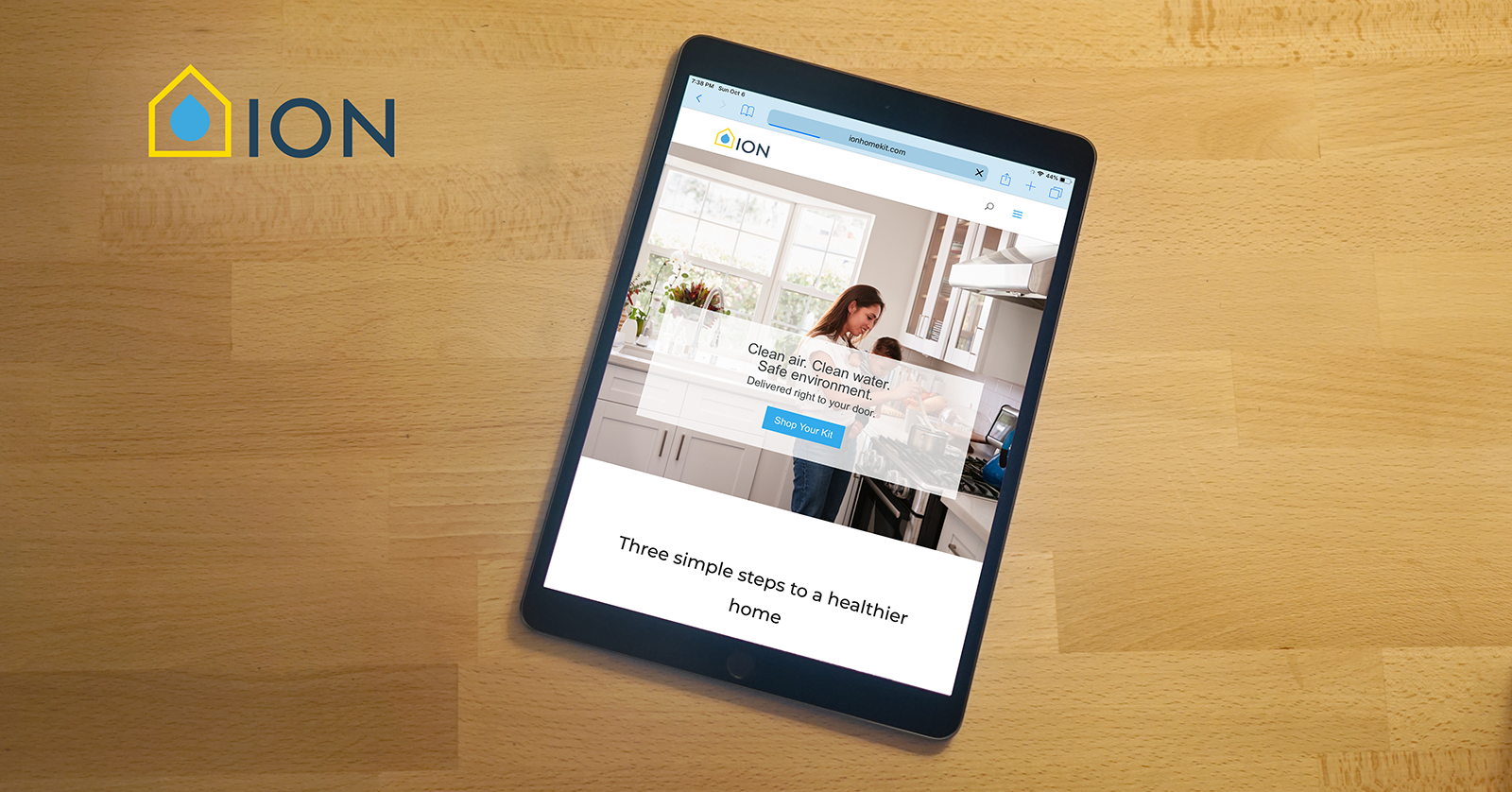
Ion Home Kit
I designed the Logo, Icons, and website for Ion Home Kit. Ion specializes in automatic home delivery of air filters, water filters, and other regularly replaced home items. The direction was light, approachable, and friendly, and focused on young families that are familiar with subscription services. www.ionhomekit.com
Overview
- Logo Design
- Branding
- Web Content
Tools Used
- Adobe Illustrator
- Adobe Photoshop
- Adobe Indesign
- Pen & Paper
- Google Drive
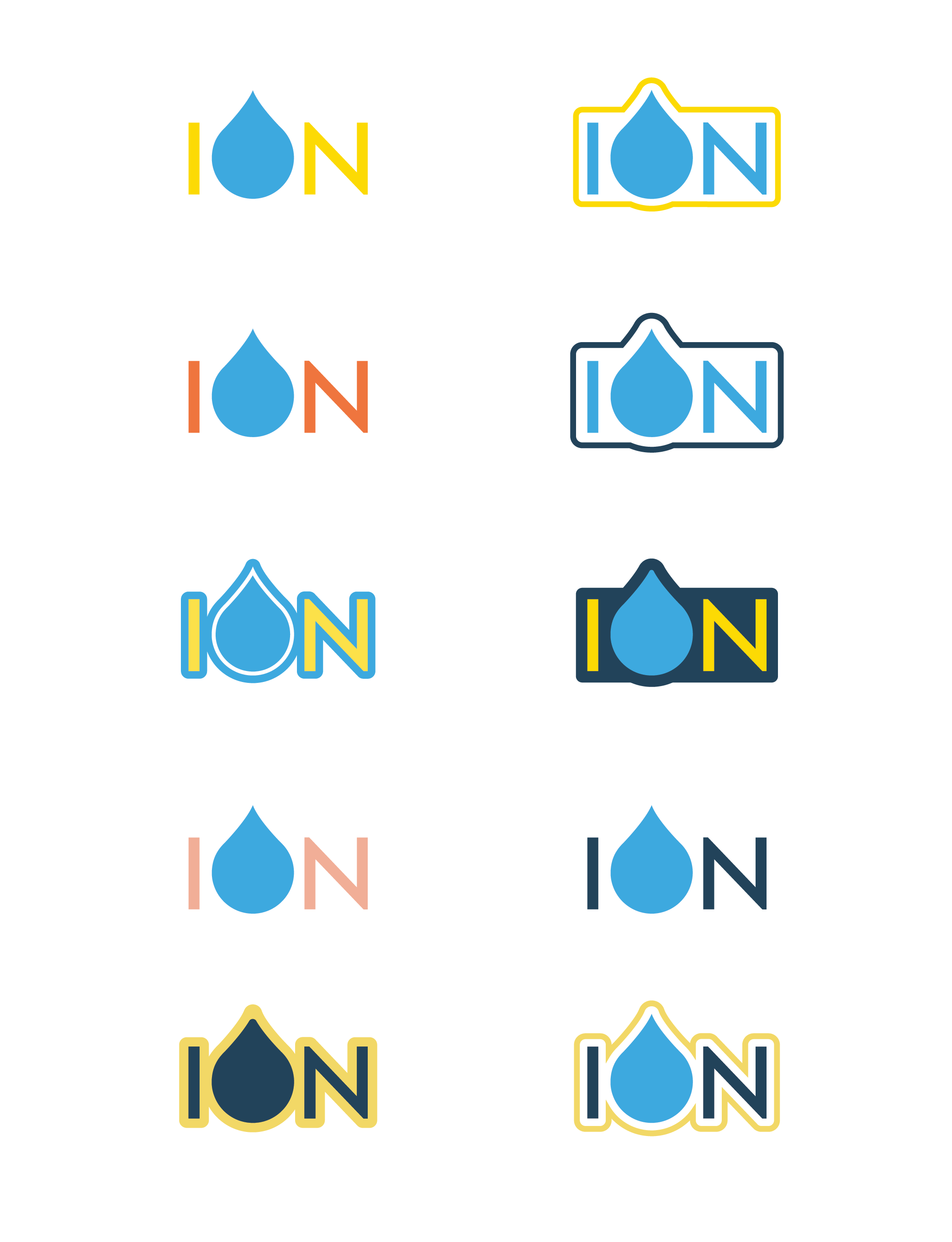
Original Logo
The logo I started with had multiple colors and gradients which made it too complex to print in most instances. It also didn't give the approachable feeling the company was going for.
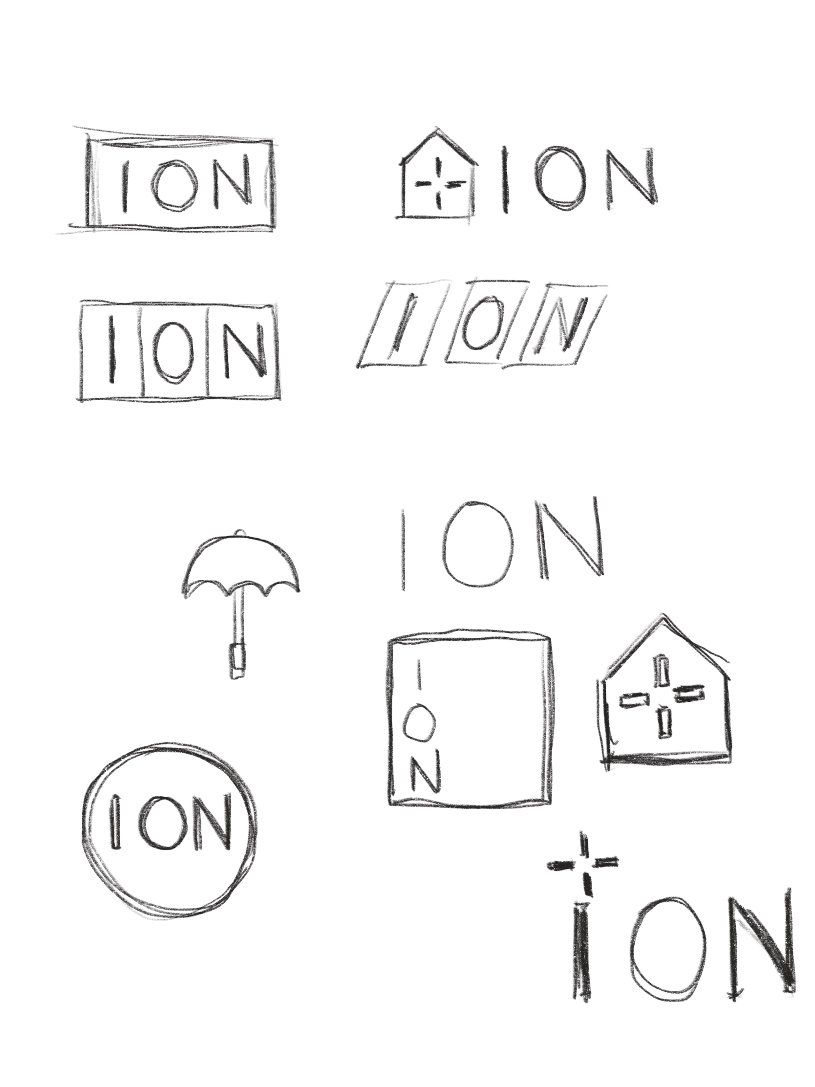
Ideation Process
The initial ideation process is always the messiest. Above are some examples of me thinking on paper. I was playing with the three letters in Ion, as well as the idea of safety, reliability, and home.
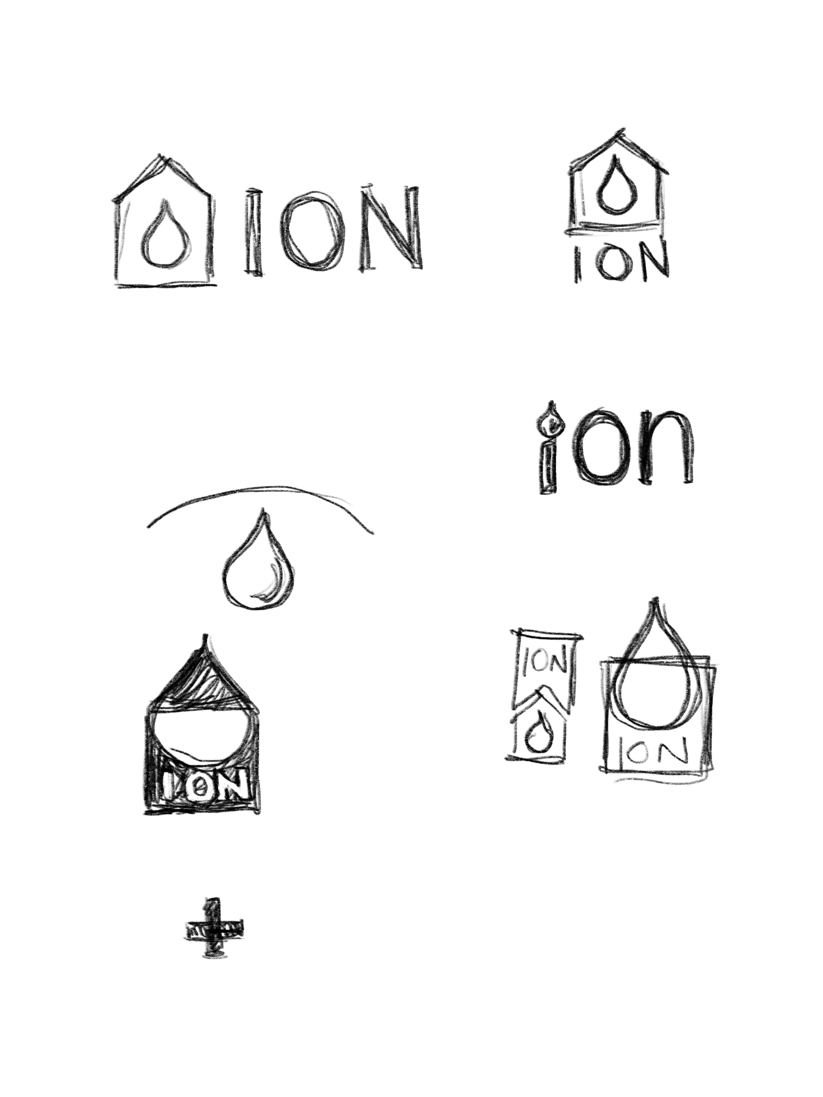
Refining the Ideas
The water droplet is still a pretty strong design element, so I created a much more simplified version of the original. This paired with the house simply illustrates a sense of friendliness and dependability. The colors and form are finalized in the version below.
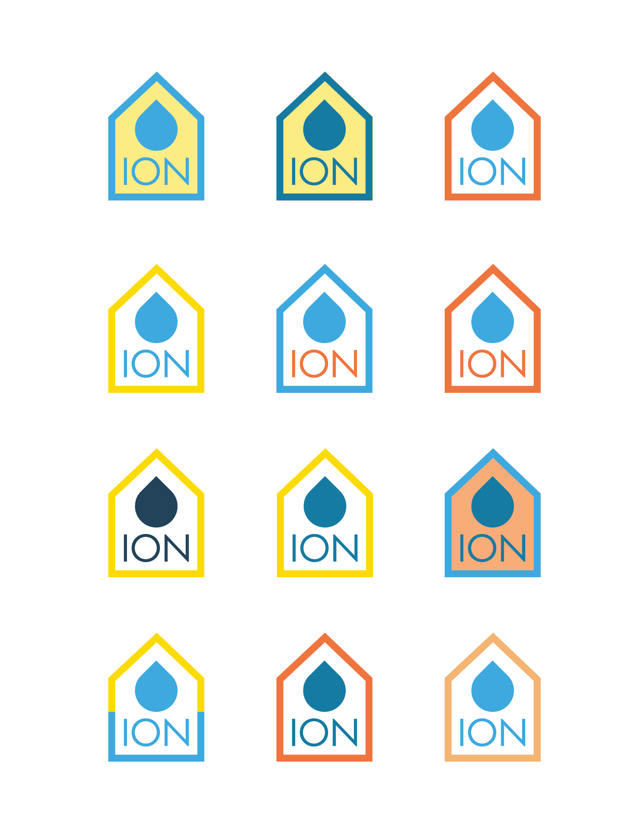
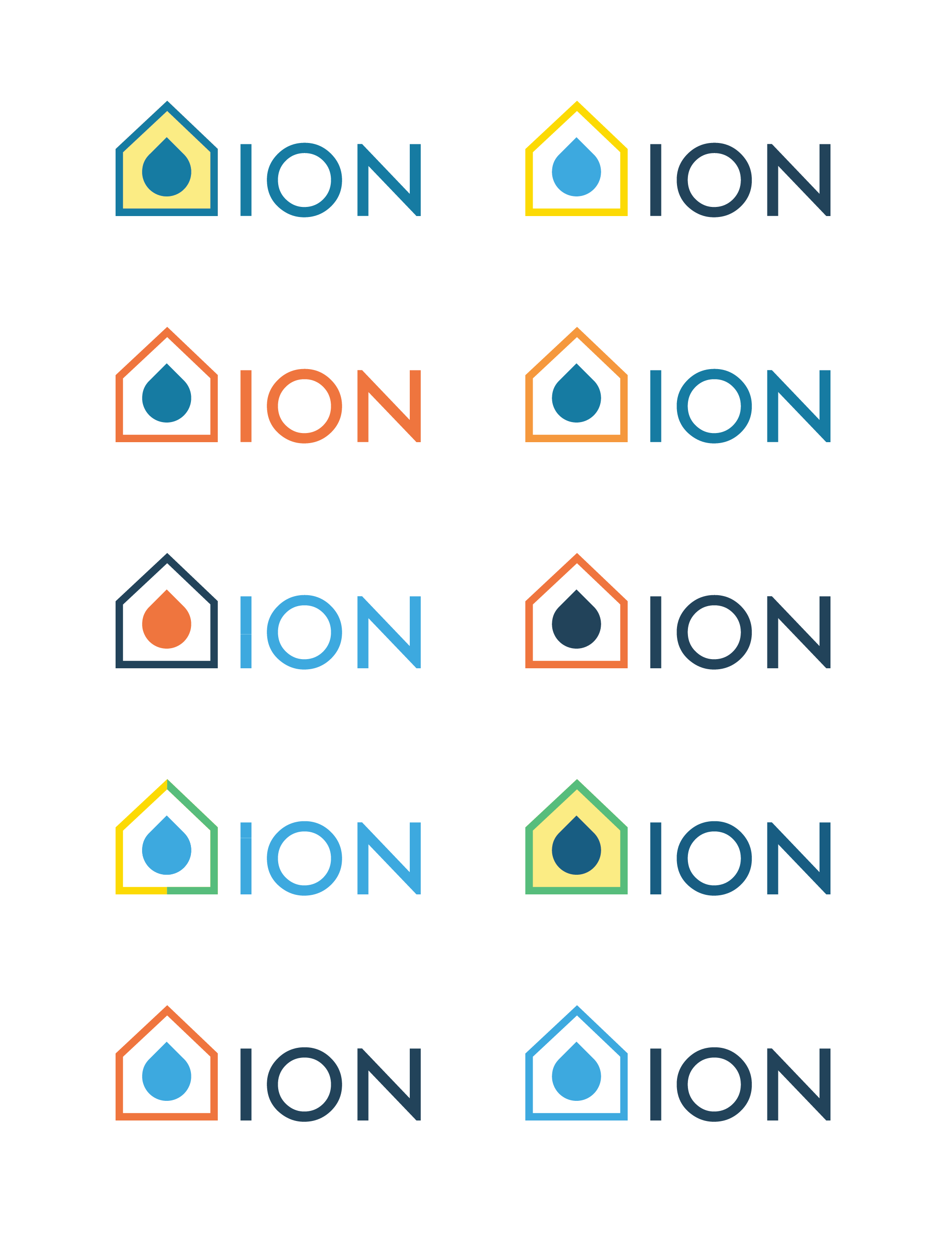
Final Logo
The logo above is the final version. It was the most versatile and well put together of the three options, and the color palette goes best with the feeling Ion wanted to convey. The water drop doesn't overpower the brand name, and the spacing and angles of the house frames the water droplet well. There are only so many options when choosing a color for a droplet, so blue was the natural choice.

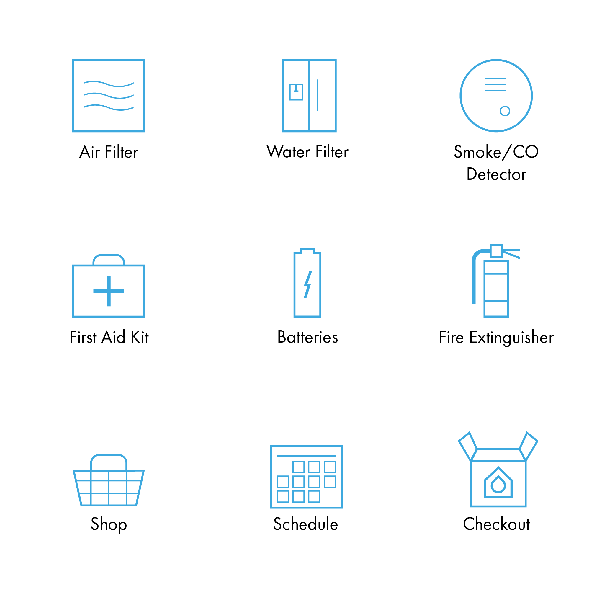
Icons
To go along with the style and color of the logo, I created icons to represent the different products that Ion provides. They are kept as simple as possible with thin lines and sharp corners rather than rounded.
Selected Works
MalakyeUI Design
BackpackerUX Design
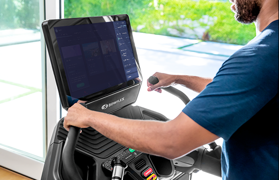
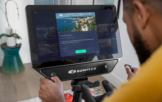
JRNY Headphone ConnectUX Design
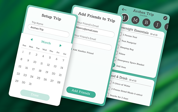
JRNY App Workout ModalsUX Design
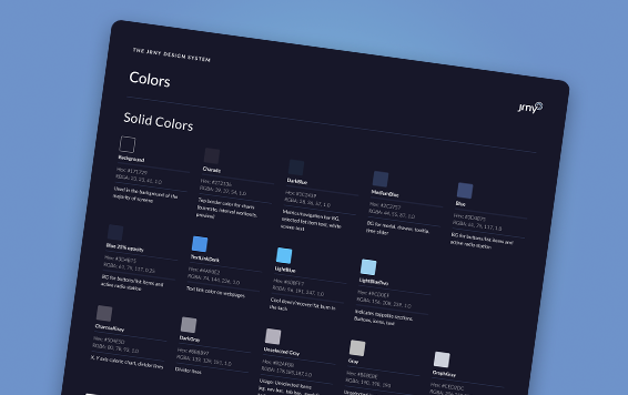
JRNY Color RefinementUX Design

Harvard BCMP ShirtGraphic Design

Haddon CulinaryGraphic Design

Bliss ProvisionsGraphic Design
LeadfeatherGraphic Design

Ion Home KitGraphic Design

Transparent PathProject type

jkulhawik@gmail.com